
Elite Riot
A cynical line that stays with you on a shirt. With Elite Riot, I explore how words, print and the attitude of an outfit reinforce each other.
Explore the collections- Brand design
- Print design
- Art direction
- E-commerce
- Supplier research
- Markets & trends
- Audience & personas
- Collection strategy
- Clothing & fits
- Campaign video
How do you let a statement speak without making the whole outfit shout?
- My choice
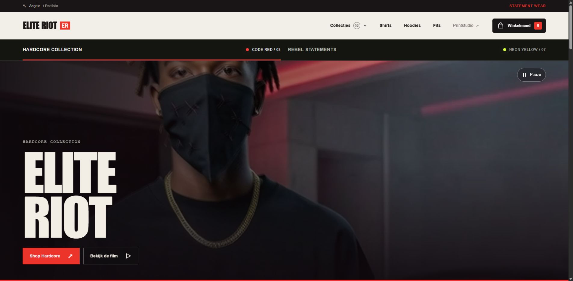
- A small ER mark on the front, the statement on the back. Red gives the Hardcore line its harder tone; yellow remains the second collection.
- What you see here
- Print designs, complete fits and a Shopify concept where the campaign leads into the collection and product choices.
The collections.
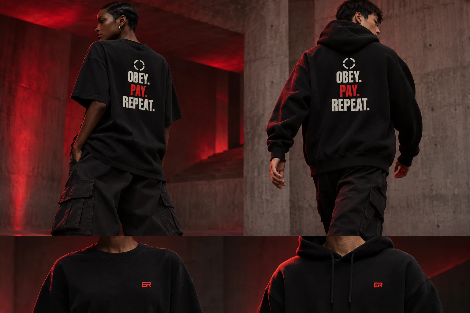 03 prints
Hardcore Collection
My harder direction. About power, ownership and who profits from the system.
View the collection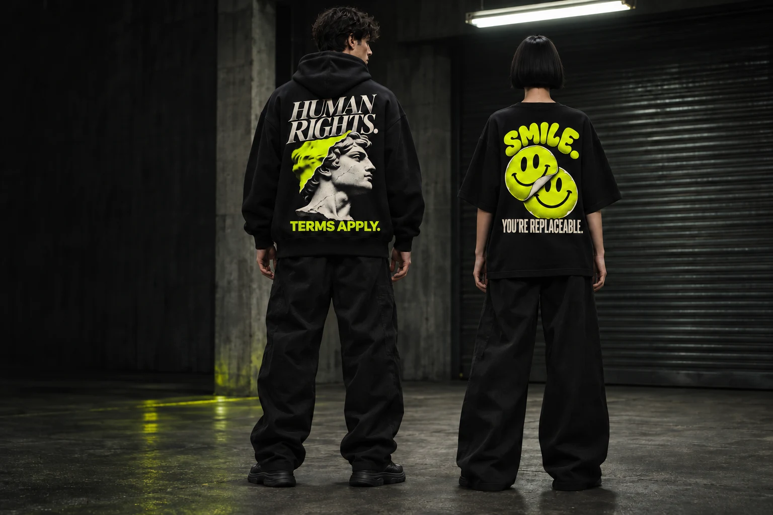 07 prints
Rebel Statements
A smile with a sharp undertone. Seven statements, each with its own illustration.
View the collection
Hardcore in motion.
With a Comfy workflow, I give the red collection the same attitude in moving images.
Watch the full filmComplete fits.
I want the clothing to work as an outfit too. With three trouser shapes, I explore how silhouette and print reinforce each other.
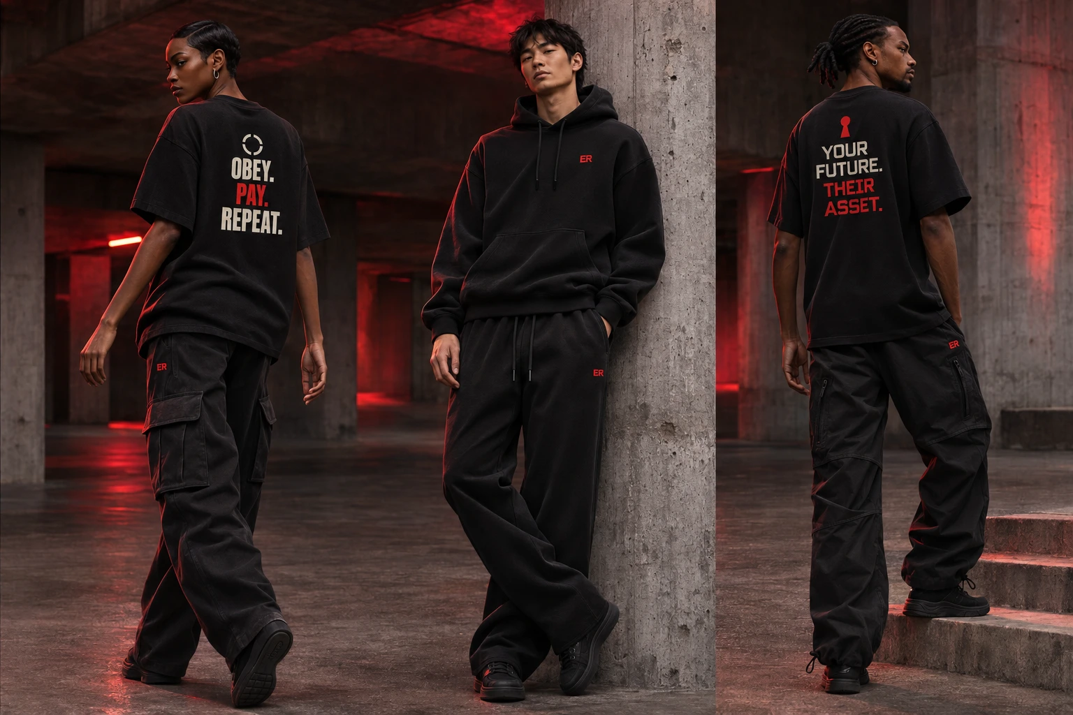
The trousers. The complete fit.
03designs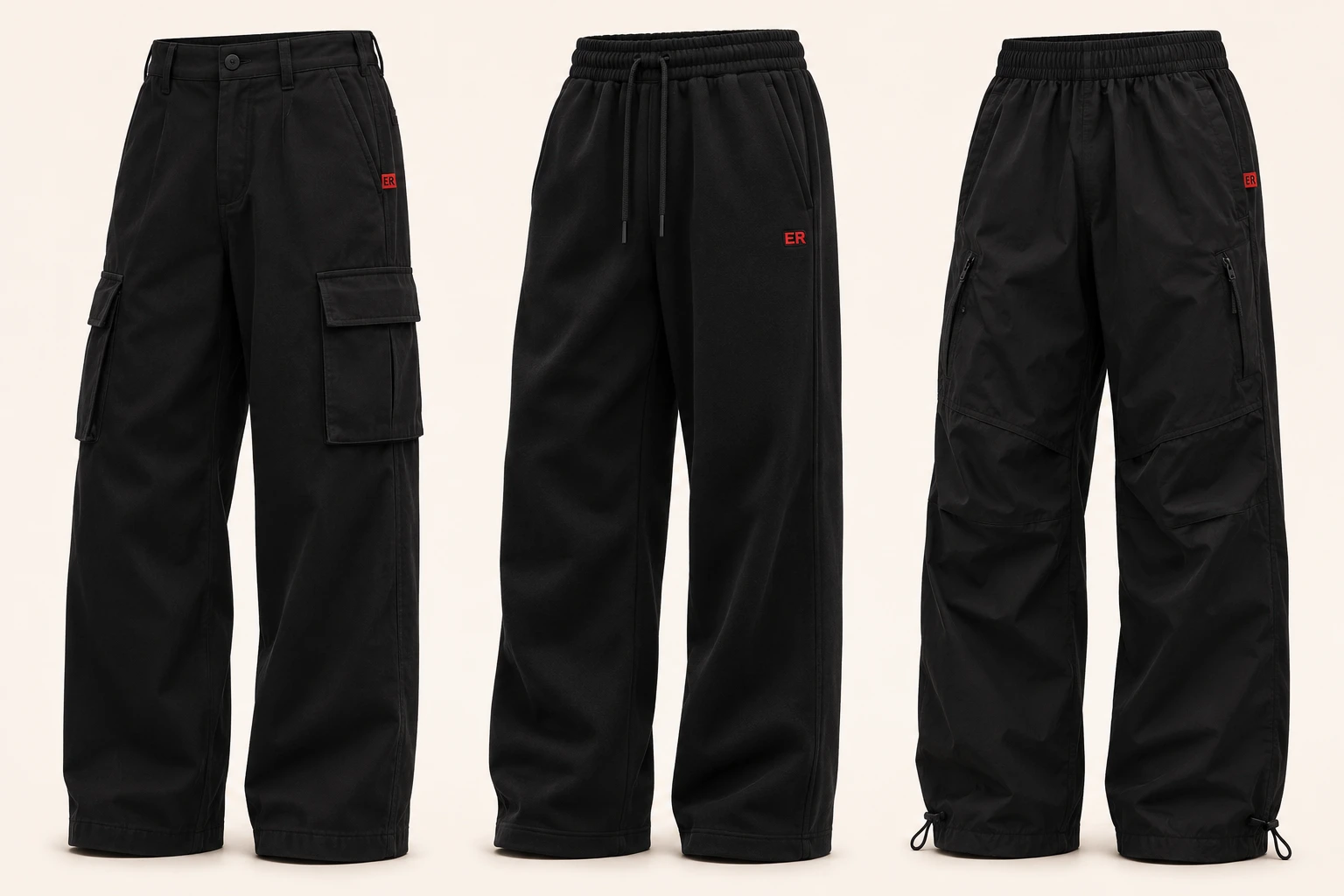
The shopfront.
The campaign draws you in. Then you should be able to explore the clothing and choose your own combination at your own pace.
About this project
A line that stays with you
What draws me to Elite Riot is the combination of humour and social criticism. WORK HARD. INHERIT HARDER. sets effort against inheritance. HUMAN RIGHTS. TERMS APPLY. gives something we take for granted an uncomfortable qualifier. How do I turn a line like that into a print you would want to wear?
I write and select the statements, design the identity and direct the image generation. I then decide how words, illustration and clothing reinforce each other. A print needs to work at a glance and still have something to say on a second look.
Letting the back speak
The front stays understated, with a small ER mark. On the back, each statement gets its own typography and sometimes one supporting illustration. The spoon and work glove, the peeling smiley and the classical bust add a second layer to the words. Extra codes and decorative lines added little, so I left them out.
Hardcore Collection is my main collection: red, more direct and focused on power and ownership. Rebel Statements is the yellow second line, with more illustration and a more playful first impression. The same brand can carry two different tones.
A print also needs to become a fit
I explore how a statement works with the silhouette and the person wearing it. That is why I am also developing trousers, different models and complete outfits. Utility Cargo, Heavy Track Pant and Parachute Pant start from white-label base shapes; the small red ER detail connects them to the tops.
There is less visible work too: exploring trends and audiences, developing personas and comparing suppliers. I want to understand how a design can grow from campaign imagery into a producible garment. The clothing is still in development; suppliers, samples and production have not been confirmed.
From brand imagery to a Shopify concept
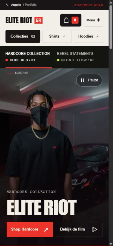
Elite Riot is my Shopify concept for statement wear. The shop should have the same attitude as the clothing. I connect art direction, collection pages and product controls so a large campaign image leads into clear choices. With the Comfy production video, I explore how the red collection can also have its own atmosphere in motion.
For me, Elite Riot is a place where brand design, clothing, research, image production and e-commerce come together. I keep developing those parts towards each other.